MourneQuest Book Cover

Cob - MourneQuest

This is a digital painting I did a while back for Garry McElherron, based on one of his characters, Cob, from his MourneQuest book. As well as The Shimnavore, it was another collaboration with John Farrelly who originally did the pencil sketch, you can see over on John’s website.

Garry has since released the book on Lulu, and he’s used this as the cover illustration, very exciting. I’d advise going over and taking a look. It’s a great read, and seems set to being a best seller soon, once it becomes readily available in your nearest good bookshop. Keep an eye out for it.

Sketch dump #1

Bit of a random sketch dump this week, a couple of pics from my pub moleskin, and a couple of topical coloured pics where I was testing out various brushes, pens and paper and practicing my colouring in Photoshop. The Dredd pic was done with brush and Tikky pen on very thin paper which wrinkled quite a lot when I blocked ink with the brush, but I was able to save it in the scan. Fink is pretty much based on the classic Mike McMahon pic, thought it would be a great tryout for my Gpen on the bristol board. That’s all, really!

Painting a Minotaur: Part 3

Woohoo, at last, here’s the third and final part of the Minotaur painting. I’m pretty pleased with how it turned out, although I still think I’d have liked to work some more on his face. I also like how the background looks, it really helps to give it a lot of depth. I’ve spent approximately 7 hours on the whole thing. Here’s the final image, let me know what you think…


Woman in a stripy dress

I bought a copy of Artrage a few months ago and have been playing around with it. I really like the pencil tool so thought I’d have a go at doing a bit of sketching.

I found some notes I’d made in the summer while sitting having a cup of coffee in town. I didn’t have anything to draw on so I just made notes instead. The first note I made was ‘-Fat girl strippy dress short black bob’ so that seemed like a good place to start!

And yes, I know I spelt ‘stripy’ wrong, thanks to the blog police (Steve) for pointing that out! 🙂

Painting a Minotaur: Part 2

Here’s part 2 of the Minotaur timelapse. I was hoping there would only be two parts, but I really got sucked into it. One good thing is that I’ll be able to see exactly how long I’ve spent on this from my screen recordings. I’m guessing Part 3 will be the last.

Painting a Minotaur: Part 1

I’ve been doing a few more rough sketches for Conflicting Kingdoms and I’ve been trying to settle on a few designs for minotaurs which will be included in some of the paintings. Some of the other artists have already done a lot of the minotaur cards, I always like to try to get a new creature design right before I start incorporating them into a full-blown illo. Then I decided to take one of them a bit further and paint him up, since I hadn’t done any painting for a wee while. I’m still working on it, but here’s Part 1 of the time-lapse. Keep an eye open for Part 2.

Colouring the Light – Part 3

Once you have the grayscale values done, it’s time to move on to the colouring. You still want to keep it flexible and loose at this stage, to make it easier for quick decisions-making.
Taking your grayscale from the previous stage, pull your blacks down to about 70% using Levels. Then create a new layer on top and set it to Multiply. When you start painting on this layer with colour it will darken what’s below, so pulling the blacks down in the previous step will counter this. Switch your brush to hard round with no pressure and start colouring. Just work in solid, flat colours for now, it will make them easier to change, since you’ll be able to Magic Wand a block of colour. This might take a bit of getting used to getting the colours right, but just play around and you’ll get the hang of it.


I’m not going to go into colour theory here, that’s a whole other set of blog posts and there’s plenty of them around. Work individually on each character and try not to let one influence the other, and play around with skin tones. Even if a colour isn’t working on one character, you can always try it on another. It also helps to keep some coordination within the colour palette for each character if you can.

Once you’re done with the basic colours, you can move on to the final stage of highlighting. Add another layer on top and switch the layer mode to Lighten. You should be able to colour pick beneath where you want to highlight, pull up the lightness and saturation of your picked colour and start painting. Work over the characters, you’ve already added the highlights at the value stage so this shouldn’t take too long. Try adding in a bit of complimentary light to the rim on one side to imply a secondary light source, just to punch the characters out a little more.
You could leave that as the final state but I’ve gone a little further and added a Normal layer and just painted over some areas to blend them in a little better and tidy it all up. I also added in a Colour layer to tweak some of the colours here and there, like the flames coming from the Sorceress’ hands. Then I added a Colour Dodge layer and lightly painted over some of the highlights to bring out more contrast. I also worked over some of the metal areas on that same layer, like the swords and armour, since the Colour Dodge method is great for adding sheen for these types of material.
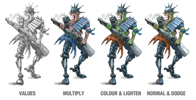
Once you’re all done, hey presto! You should have a decent set of characters for your portfolio!
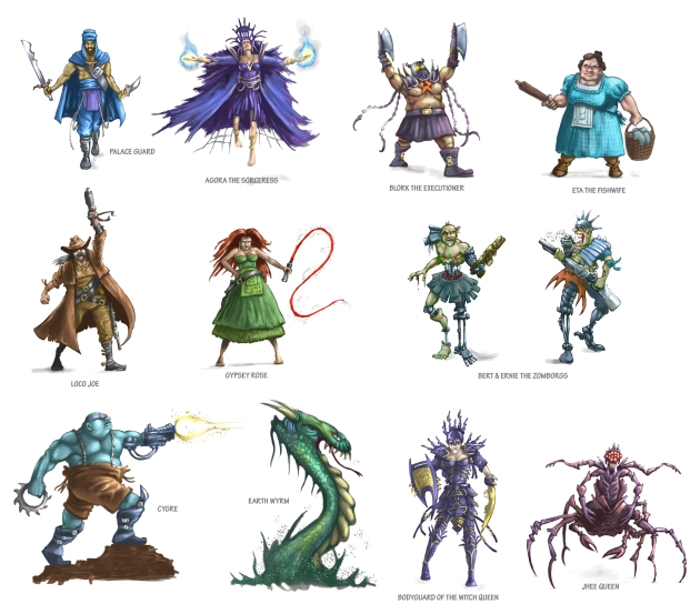
Later on, I’ll take two or three of these designs and work them up to a more polished character design with side and back views.

If you have any questions, or even any tips to add to this just pop them in the comments below.

Part One – Embrace the Shadow

Part Two – Lighting the Shadows

Lighting the Shadows – Part 2

Taking the silhouettes and scanning them into Photoshop, you can start working on adding some depth. It is more obvious on some of the silhouettes what type of character they will end up as, but you shouldn’t be afraid to completely change them if an idea comes up, just keep doodling and sculpting it into something you think works. What you shouldn’t do is use reference of any kind at this point, it all has to be loose and come straight from your head, just rely solely on your imagination.

The biggest advantage of working with silhouettes is that you haven’t invested too much time with them yet, so there’s no need to get precious about them. If you compare the original scan you can see I drastically changed the complete design of the sorceress while still keeping the same basic pose. What you also should do at this point though, is use the opportunity to fix any proportion issues.

I just used a round hard brush with pressure set to Opacity and switched back and forward between various sizes. Don’t worry about any textured brushes, just concentrate on filling out the characters and getting your values right. The other thing you should do at this stage is to pull the black of the image down to 50% gray, this will give you the scope to add both highlights and shadow to the figures.

PS POWERUSER TIPS:
d key – Switches the Foreground and Background to black and white respectively.
x key – Toggles the Foreground and Background colours.

Here’s a few stages with a couple of the figures to show you what I mean.

Sorceress silhouette: Click to enlarge

Cowboy silhouette: Click to enlarge

And here is the final set. I’ve given them all names to make them easier to identify, and also to help me remember what direction I want to push them to the finished stage. Next up is colouring.

Click to enlarge

Part One – Embrace the Shadow

Part Three – Colouring the Light

Conflicting Kingdoms Set 6

Here’s the final set of cards for now, I’m taking a break for a couple of weeks from them while I get a few other things sorted out, and maybe work on a couple of other things. This set finishes the Konk themed, all five are location cards: a training dojo, a bridge over the waterfall, the air shrine, the Konk’s ‘canteen’, and finally the Konk’s treehouse market. The market was probably my most complicated and detailed card I’ve done, it was a tricky one to plan out.
I first did a couple of colour sketches to figure out the composition and settled on this:

After that I decided to go and build a rough primitive version in 3D, to help me both with the perspective and the lighting and shadows:

I’ve only tried this method once before, but it was a big help with getting the artwork finished quickly and on time, and I was really pleased with how it turned out.
Really looking forward to seeing these printed and part of the deck.

JUST ONE LAST NOTE: For anyone who has bookmarked or subscribed to this blog, please note that I’ve now changed the address from http://starfox99.wordpress.com to https://iluvpixels.wordpress.com. Now that I’ve got a bit more used to WordPress this seemed like a more sensible idea, so don’t forget to resubscribe or change your bookmarks if you want to keep receiving updates. Thanks for your continued support.

Conflicting Kingdoms Set 4

I’ve had a bit of a technical disaster since my home iMac gave up the ghost on me a couple of weeks ago. I ‘have a man’ (you know who you are), who’s hopefully gonna give it a going over with some serious soldering work so fingers crossed that the surgery will work. In the meantime, I’ve had to take a technological step backwards by about 10 years and get my old G4 desktop working again. So far so good, although it’s slow as hell, but it’ll do for now. Good job I had all my artwork backed up to an external, so no worries there. The only thing art-related I might have lost are all my custom Photoshop brushes, but they may be backed up somewhere too, that’s next on my list to do.

For now though, I’ve finished these four more cards for the Conflict game. The guys at Conflicting Kingdoms have now asked me to work on a themed deck for the game. You may have noticed I’ve done a lot of ‘Konk’ related cards so far, so that will be the theme of the deck containing my artwork exclusively, so I’m pretty excited about that. I still have about 10 or so more cards to do for that before May, so here’s hoping the G4 holds out til then!

On another note, I’ve just started another blog up called ‘I Luv Voxels’ where I will be keeping any Blender 3d work, for anyone who doesn’t want to wade through all the 2d stuff here. I’ll probably double post it here too though, just in case!